
Have you ever wondered why certain colors are often associated with specific industries? For instance, many fast-food companies use red in their corporate branding, while technology companies tend to favor various shades of blue.
There’s a reason for this. A brand's colors are intended to project a certain image, reflect a certain energy, or send a message about the business’ products and the company’s trustworthiness. These companies are attempting to influence their target audience by taking advantage of their emotional reaction to their corporate colors.
The psychology of color is a fascinating science, exploring how people interpret these “color cues” and studying how those responses shape future behavior in terms of clicks, trust, appetite, and—ultimately—purchasing decisions.
People tend to make quick decisions about a business based on how the company displays their corporate brand. A lot of that opinion is based on color. After all, we learn our colors at a very young age and our responses to them are often visceral. That’s why color is the first thing we typically notice about a brand (think McDonald’s and golden arches).
The things you associate with a certain color will influence what you think of a brand that uses that color. When you see, say, green, what is your first thought? Is it money? Is it environmental and eco-friendly? These involuntary reactions will bleed over into your opinion of any company that includes green in their corporate palette.
Studies have found that brands using deeper blues and clean neutral colors tend to be perceived as more stable and restrained, placing them in a more trust-heavy category, while brands that employ bolder and warmer colors fall are viewed as more experience-driven.
What does your corporate color say about the level of trust people might have in your company or industry? Let’s explore some common corporate colors and learn what they represent.
Common Brand Colors
The following colors are frequently used by companies as their primary or secondary marker. For some companies, these are the colors that people most commonly associate with their brand. With some of these colors, perceptions change with different shades; we’ll dive into those situations when they arise.
Red
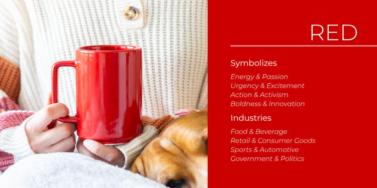
Red as a primary or secondary color is typically associated with energy and passion; urgency and excitement; action and activism; and boldness and innovation. Some of the industries that commonly include red in their corporate palette are food and beverage, retail and consumer goods, sports and automotive, and—perhaps not surprisingly—government and politics. 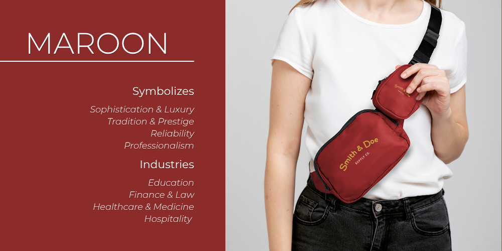
Maroon
Maroon, described as a dark, rich shade of brownish or purplish red, creates perceptions of sophistication and luxury; tradition and prestige; reliability; and professionalism. The use of maroon as a primary or secondary color can be found in education, finance, law, healthcare and medicine, and hospitality. 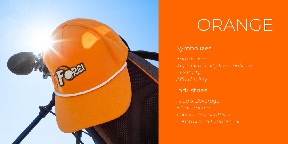
Orange
It seems orange has grown in popularity over that past decade. That’s no surprise, considering it symbolizes enthusiasm; approachability and friendliness; creativity; and affordability—characteristics that are highly valued. Orange can be found most frequently in food and beverage, e-commerce, telecommunications, and construction and industrial companies. 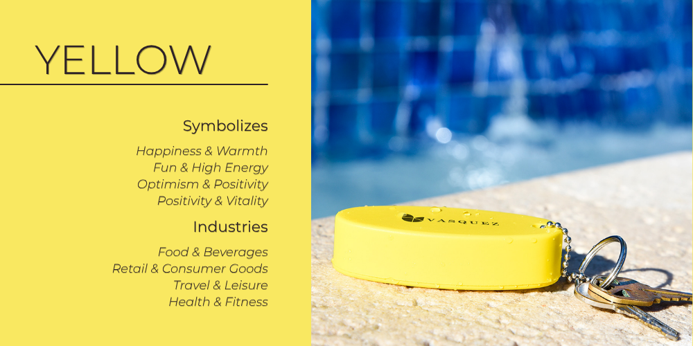
Yellow
A nice, gentle, and soothing color, yellow is intended to convey a sense of happiness and warmth; fun and high energy; optimism and positivity; and vitality. This sense of lightness and hope is most at home in food and beverage, retail and consumer goods, travel and leisure, and health and fitness. 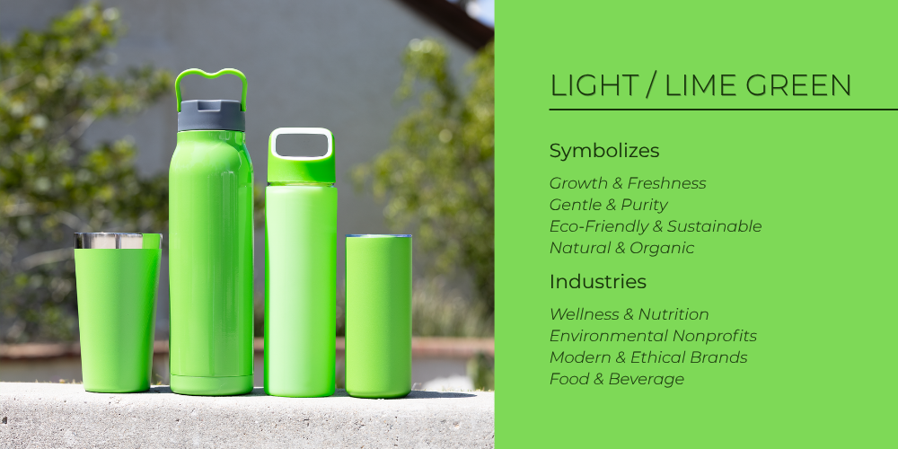
Light/Lime Green
Since the human eye can discern more shades of green than any other color, it’s only fitting that it should be the subject of our first exploration of a shaded color. Light and lime green symbolize growth and freshness; gentleness and purity; eco-friendliness and sustainability; and natural and organic. Naturally, such a wholesome color can be found most often in industries such as wellness and nutrition, fitness and health, environmental nonprofits, modern and ethical brands, and—as with most other colors—food and beverage. 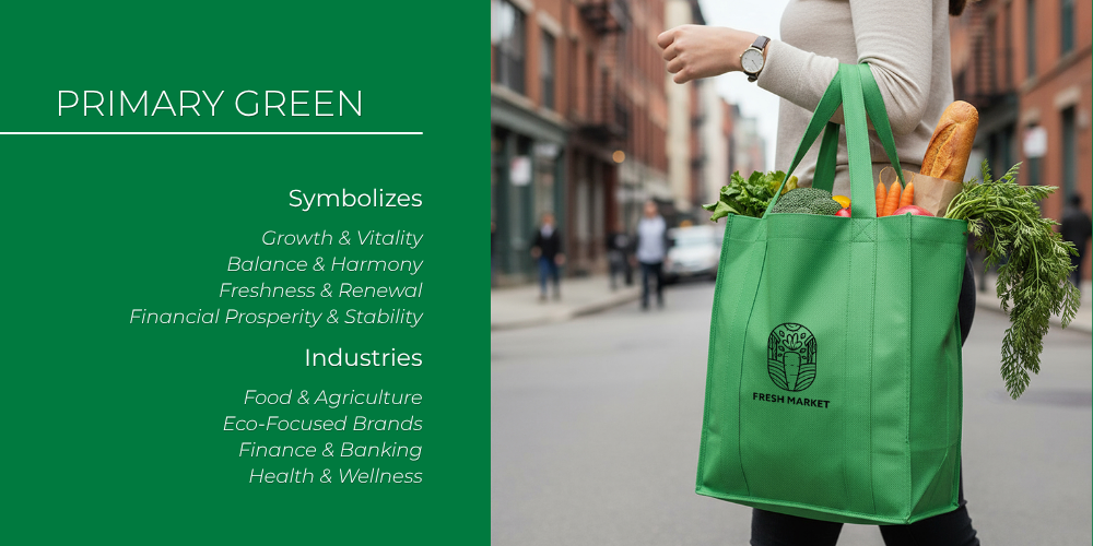
Primary Green
Sitting in the middle of the spectrum, primary green conveys a sense of growth and good luck; of balance and harmony; of freshness and renewal; of health and tranquility. Primary green is also associated with action (think green traffic lights). No wonder it’s commonly found in spas and fitness centers, finance and banking, sustainability and eco-focused brands, food and agriculture, and innovative brands such as Starbucks and WhatsApp highlighting their “fresh ideas.” 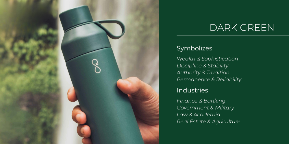
Dark Green
At the far end of the scale, dark green evokes a sense of wealth and sophistication; discipline and stability; authority and tradition; and permanence and reliability—attributes coveted by industries such as finance and banking, the government and military, law and academia, real estate, and agriculture. 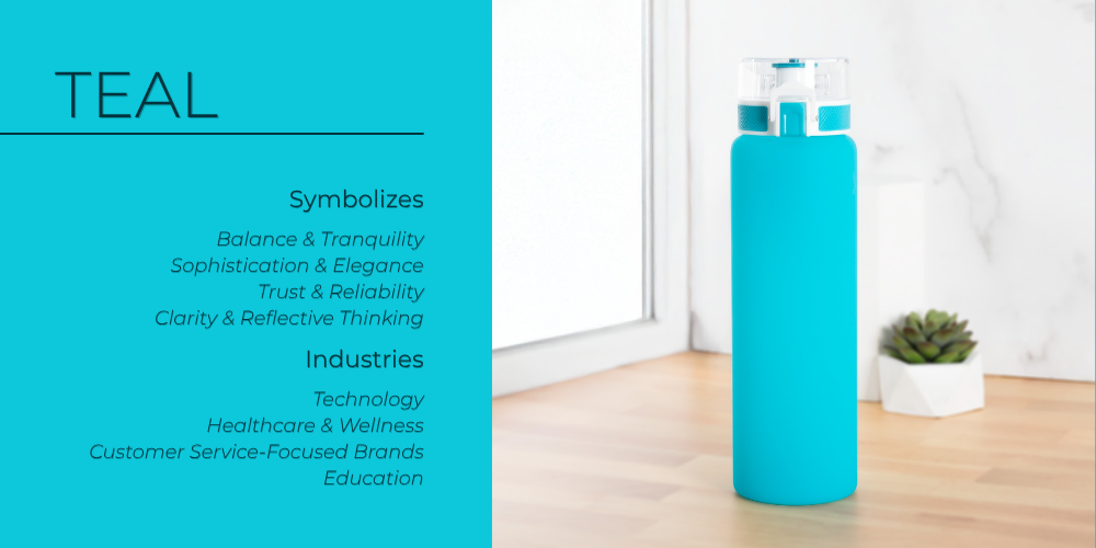
Teal
Widely considered a balanced, versatile hue, teal evokes both the depth of the ocean as well as the tranquility of the forest. It represents cleanliness, relaxation, and clarity; balance and tranquility (calm blue combined with vibrant green); sophistication and elegance; trust and reliability; clarity and reflection; and cleanliness. Teal is popular among technology companies, healthcare and wellness providers, and customer service-focused brands that want to project transparency and fairness. 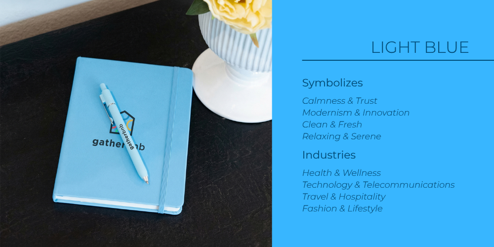
Light Blue
Another shade, light blue represents calmness and trust; modernism and innovation; cleanliness and freshness; and all things relaxing and serene. Light blue is often used by health and wellness companies, as well as in technology and telecommunications, travel and hospitality, and fashion and lifestyle. 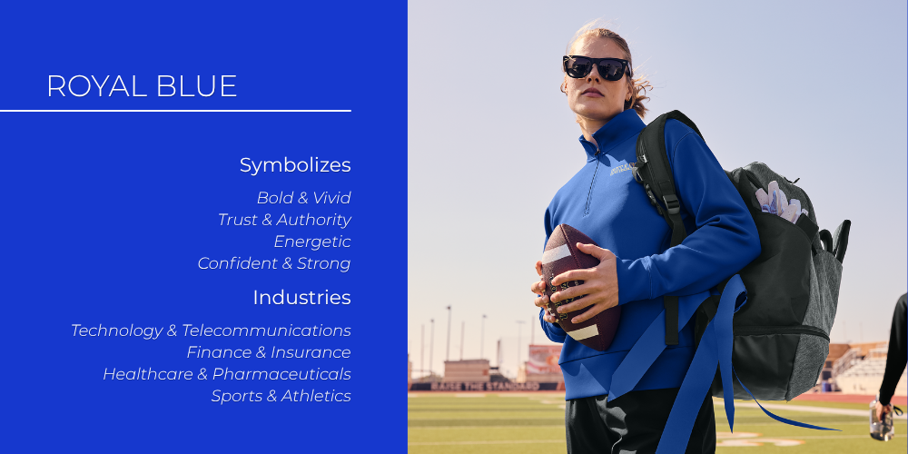
Royal Blue
An expressive and vivid color, royal blue symbolizes boldness, trustworthiness, and authority; energy; strength; and confidence. Not surprisingly, royal blue is favored by companies in the technology and telecommunications fields, finance, insurance, healthcare, pharmaceuticals, and sports/athletics. 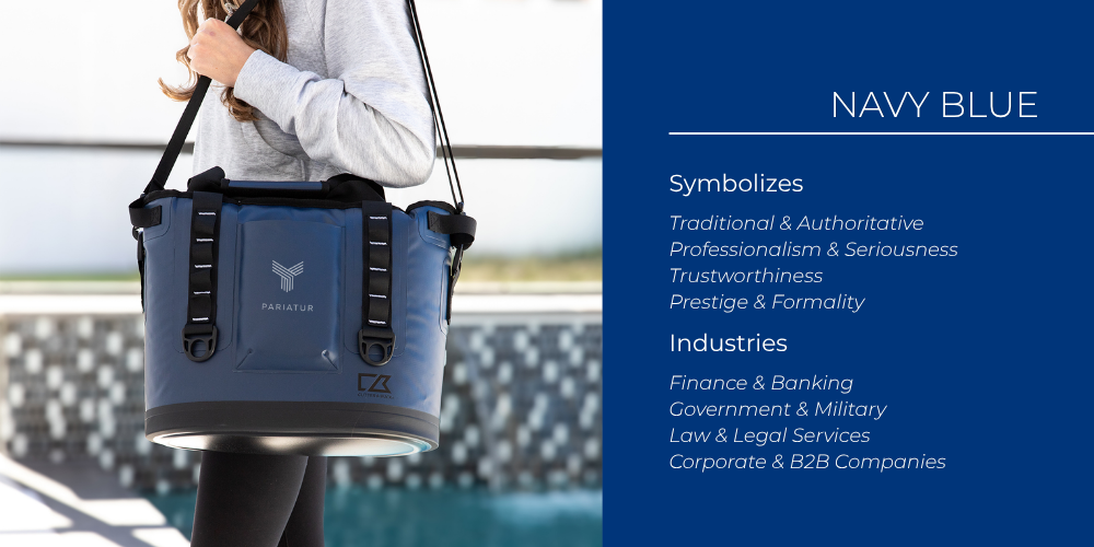
Navy Blue
Strong and powerful, navy blue represents tradition and authority; professionalism and seriousness; trustworthiness; prestige; and formality. Industries that favor these characteristics include finance and banking, the government and military, law and legal services, and business-to-business (B2B) companies. 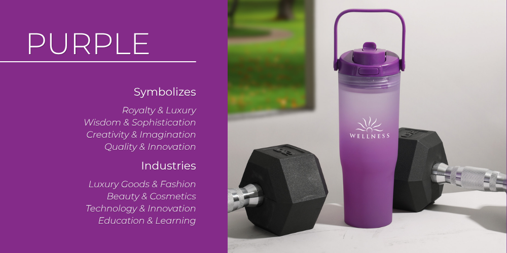
Purple
Purple has a long history of prestige, imparting a sense of royalty and luxury; of wisdom and sophistication; of creativity and imagination; of quality and innovation. As a brand color, purple is found in luxury goods and fashion, beauty and cosmetics, technology and innovation, and education and learning. 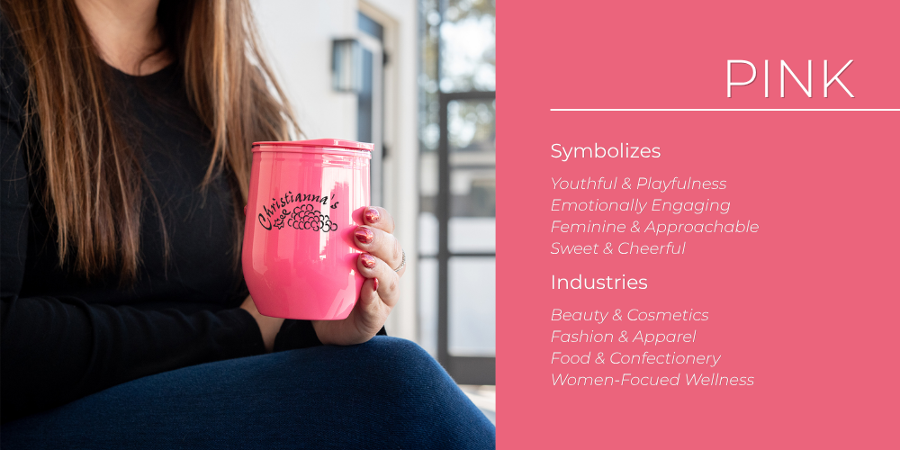
Pink
In the 2020s, the color pink is enjoying a resurgence of popularity due to its association with youth and playfulness; emotional engagement; femininity and approachability; and sweetness and cheerfulness. Naturally, pink is most often found in industries such as beauty and cosmetics, fashion and apparel, food and confectionery, and female-focused wellness.
Universal Colors
Universal colors are generally considered more neutral and stable and therefore are most frequently used as accent or secondary colors. Even so, these colors still have their own identities and impart unique feelings or perceptions to the user. 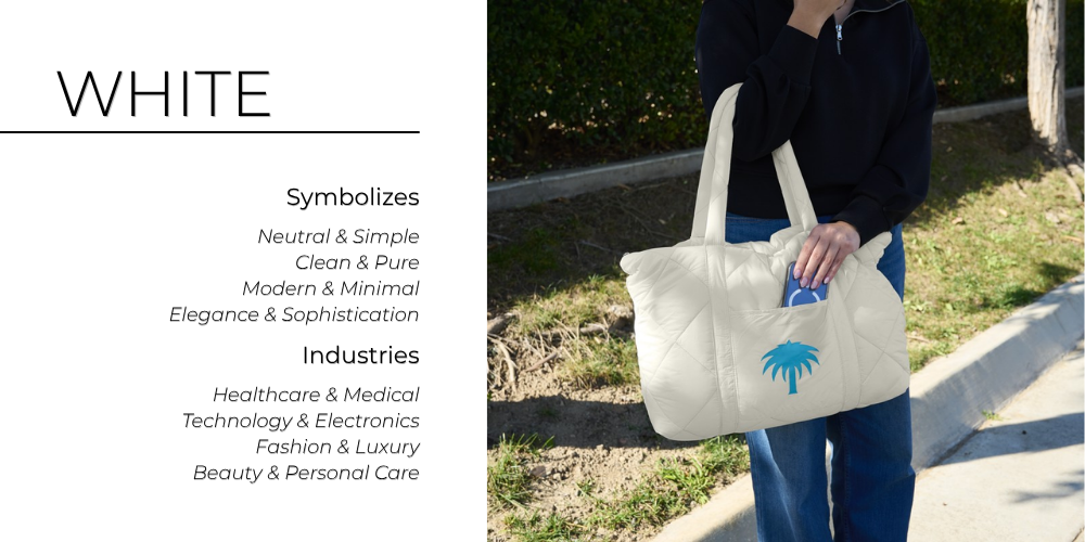
White
A tabula rasa, the color white represents neutrality and simplicity; cleanliness and purity; elegance and sophistication; and minimalist modernity. It is favored by the healthcare and medical industries, technology and electronics, fashion and luxury, and beauty and personal care. 
Gray
Flexible and non-committal, halfway between black and white, gray symbolizes durability and reliability; understated neutrality; sophistication and professionalism; and practicality and reliability. Gray is used as an accent color by many industries such as technology and electronics, automotive and transportation, corporate and professional services, and finance and banking. 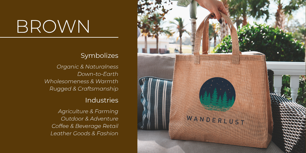
Brown
The ultimate earth tone, brown is down to earth, wholesome, and warm, conveying a sense of organic naturalness and rugged craftsmanship. These are attributes valued by agriculture and farming, outdoor adventure, coffee and beverage retailers, and leather goods and fashion. 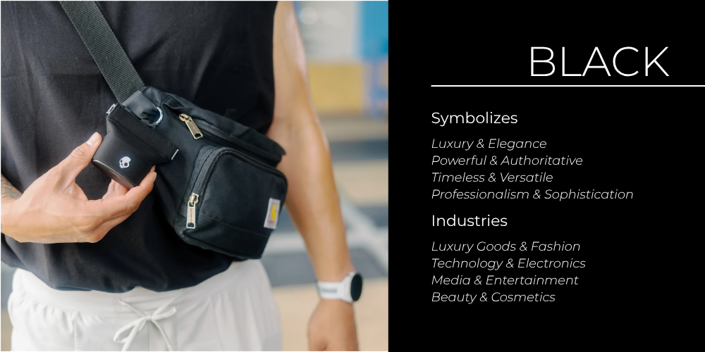
Black
A perennial favorite, black promotes luxury and elegance; power and authority; timelessness and versatility; and professionalism and sophistication. Found virtually everywhere, black is especially popular in luxury goods and fashion, technology and electronics, media and entertainment, and beauty and cosmetics.
What Does Your Corporate Color Say About You?
Corporate colors, both primary and secondary, define your company’s perception and bridges all your web, social, and product branding. What does your color say about your business? Is it consistently applied, or is it scattered and inconsistent? How does that influence customers and prospects?
OnFulfillment can help you fully leverage your corporate colors with branded promotional products and printed collateral that enhance the image you’re trying to project. Want to learn more?